In what ways does your media product use, develop or challenge forms and conventions of real media products?


Editing Log - Session 3 - Improvements
Editing Log - Session 3 - Improvements:
Editing session 3 on ancillaries primarily consisted of working on improvements that I discovered from audience feedback from the Hollywood demographic. They said that fonts, vinyl shape and cd tray placement was to be worked upon.
I changed my font from Superclarendon to American Typewriter as it was plain and standard font which represents the Britpop genre. I also changed the shape of the vinyl cover to a more square shape rather than rectangular shape that was previously. This was done in order to make it look more realistic as if it was the actual product in real life in front of you. I also moved the dic tray from top left to the top middle of my digital so it would also be in the correct place as if it was a product sat directly in front of me.
Overall, this post is to summarise the changes and reasons for the changes to my rough ancillary tasks in order to gain constructive criticism to gain maximum potential of the product.

Audience Feedback
Audience Feedback:
I showed people of the Hollywood demographic my magazine advert, digipak and vinyl edits for Under The Radar. Everybody was impressed with the content of all of the institutional information included swell as the images chosen. They said it looked to industry standard and could fit in.
However, when I asked about what ic Ould improved I was told by the majority that the font didn't suit the genre. It was apparently not bland enough and standardised to the fonts used by the Britpop bands. So I will be looking to change this in order for it to look more like a Britpop piece.
Another thing mentioned, on the digital part, that the disc tray section was in the incorrect place. This means that I will also m one this from the top left too the top middle part of the digipak template. In the same area, the vinyl was told not to be an even square and look evenly distributed but more of a rectangle. I will change this by editing the size and shape of the front and back cover to make it look more professional.
The point of this post was to gain constructive criticism on my ancillary tasks in order to make improvements that would match my target audience.


Editing Log - Session 1 - Digipak and Vinyl
Editing Log - Session 1 - Digipak and Vinyl:
During this session I decided on what pictures would be included on my digipak. I selected 6 photos to place upon the template which I thought were the most suitable and best photos to use.
I began by starting on the front cover. I began to create layers in order to edit my photos. After learning how to do colour isolation I started with that selecting the parts to stay in colour (me, Jack Davenport and Jack Rundle). Once I highlighted the parts using the quick selection tool I added a layer to change the background colour to black and white. I then decided to repeat this for my back cover and a fold in cover. I again used the quick selection tool highlighting around myself and adding a layer to change the background to Black and white. The other three photos I decided to use I changed it just into black and white.
Once this was done, I added the institutional information. I began by adding the Logo onto the spine, front cover and back cover of my digipak. I then added the album title, song names and copyright disclaimer to the back and front cover (using my selected font Superclarendon). I then added a barcode to the back cover too and after that the placement for the CD itself.
After this was done my digipak was ready. To make the vinyl cover i just required the front and back cover of my digipak to place it into my template.
In this session I created both the digipak and vinyl covers. It went as plan and previous research helped me achieve what I wanted to matching my expectations and the genre convention expectations as well.

Colour Isolation (Photoshop)
Colour Isolaltion (Photoshop):
This research was conducted in order for me to learn how to actually do the colour isolation technique in the Photoshop software. This is also for me to create synergy between all 3 platforms of media: Music Video, digital and magazine advert.
Practice Photos
Practice Photos:


This post was required in order to gain an idea of what could be used on both ancillary tasks. This matches the location research, it is also similar to the music video production of location research too. This due to choosing location heavy in urban stereotypes with brick work, always and industrial work. This will be of use to me when choosing the final images as I have many to choose from when going ahead to make the magazine advert and digipak.
Logo Research
Logo Research:
Whislt researching logos of britpop bands I discover that most britpop bands use similar styles. This styles I plain black and white logos predonitnelty. Some obviously do have a bit of colour making it stand out a bit more. Also, The Stone Roses have a picture within their log which is unique when I looked across logos within the genre.
Based upon this research I will take on board ideas and inspiration from other band's logos. I would like to include a black and white logo with a coloured picture related to the band name, Under the Radar.
Location Research
Location Research:
I decided it would be best to carry on the urban theme to represent the group roots and its ideology. Goodwin stated this in his theory about the Band's image and this can be displayed using the urban locations to represent them and their background. Carrying on this theme of urban locations we decided to go around Altrincham scouting out any potential locations for our urban theme to be used.
We decided locations were brickwork was there, passage ways, train tracks, roads anything you would find in a suburb to be used as a photo including the band members or not.


The research was required in order to be prepared to do the shots we intended and my vision to be met too.
Album Name
Album Name:
In relation to the band name there is a link. This because of the hidden message behind our band name linking to the Wonderwall music video narrative.
In conclusion this post is to inform of the reason of the album name and its meaning and relation with the Band name.
The end name of the album we came up
with was Wonderwall. This is because many Britpop albums have been named after
a song which has been included on the album i.e. (What's the story) Morning Glory
by Oasis and The Smiths Meat Is Murder. We felt this was the best thing to do
as it is a convention as well as a great song showing its importance
deserving the album to be named after it.
In relation to the band name there is a link. This because of the hidden message behind our band name linking to the Wonderwall music video narrative.
In conclusion this post is to inform of the reason of the album name and its meaning and relation with the Band name.
Band name
Band name:
With this idea we came up with many names such as: The Myths, The unknown, The Unnamed. However, I came up with the band name: Under The Radar. Everyone agreed with the band name as they felt it suited the idea of what we were trying to encode and promote in relation with the music video narrative as well as the album name being called Wonderwall itself.
This post is to express the reason that are band was given the name, Under The Radar, and its message behind it.
After a discussion as a group
we came to a conclusion on the name of the band. We went along with the idea of
linking it to the song Wonderwall and our stand for the narrative. This is
because the mystery girl doesn't even know that myself (singing in the video)
exists. The reason being the whole video aims at expressing his love to an
unknown girl but he too is also unknown to the mystery girl from her
perspective; due to him being unable to get with her due to class inequality.
With this idea we came up with many names such as: The Myths, The unknown, The Unnamed. However, I came up with the band name: Under The Radar. Everyone agreed with the band name as they felt it suited the idea of what we were trying to encode and promote in relation with the music video narrative as well as the album name being called Wonderwall itself.
This post is to express the reason that are band was given the name, Under The Radar, and its message behind it.
Font Research
Font Research:
The fonts used in typical albums by Britpop bands tend to be very bland and simple. This also helps connate that the band are simple just ordinary people too. Many of the bands use clear block white/black texts to display the Album name, song titles and institutional information on the Digipak.
The text I have decided to use on both my Magazine Article and Digipak is Superclarendon. In a white colour. This to stand out of the black dull background and to be eye-catching to the audience. I think this font suits the genre conventions based of off my research as it is very simple and can be used to display the information I want.
The reason for this research is to gain an idea of what font I can use in order to make sure it matches the conventions of the genres and look realistic to an album typical of the Britpop genre.
My Initial Idea
My Initial Idea:
I will Create synergy by using the colour isolation technique on Photoshop. This is because across 3 different media platforms it will be done helping create synergy. The album will also be could Wonderwall as most albums are titled after a song title. This synergy of Wonderwall on all media platforms as well as the colour isolation help create relativity to the audience showing a relationship between the products. This is because colour isolation is iconic not just in my version of the Wonderwall video but the original, spreading this across all platforms helps connote its significance.
My other pictures on my digipak will include black and white images of urban features linking to the convention of urban areas and Britpop relation.
For my advert in the magazine I will include all the institutional information as well as colour isolation too for synergy purposes. This will also be set in an urban area too for convention purposes. I will include a review section to relate to mainstream audience as they would be influenced by big magazines opinions on the album.
The purpose of this post was to summarise relationship and synergy and the reasons for it across the media platforms.
My idea for both of the
ancillary tasks is to display the band members all together. This is
because it is a key pattern I found whilst researching the genre
conventions. So in my shots I will have the band members together. This
will be done on the magazine as the image itself and the front cover of the CD.
I will Create synergy by using the colour isolation technique on Photoshop. This is because across 3 different media platforms it will be done helping create synergy. The album will also be could Wonderwall as most albums are titled after a song title. This synergy of Wonderwall on all media platforms as well as the colour isolation help create relativity to the audience showing a relationship between the products. This is because colour isolation is iconic not just in my version of the Wonderwall video but the original, spreading this across all platforms helps connote its significance.
My other pictures on my digipak will include black and white images of urban features linking to the convention of urban areas and Britpop relation.
For my advert in the magazine I will include all the institutional information as well as colour isolation too for synergy purposes. This will also be set in an urban area too for convention purposes. I will include a review section to relate to mainstream audience as they would be influenced by big magazines opinions on the album.
The purpose of this post was to summarise relationship and synergy and the reasons for it across the media platforms.
Conventions of a Britpop Magazine Advert
Conventions of a Britpop Magazine Advert:
This research I conducted is to help me recreate the Britpop genre and to have an influence on my advert. By including the institutional information and band togetherness synergy from across all media platforms, it should have a place within the genre.

Again there is a togetherness with
the band with all of them being on display on the image. All information I
researched is on their normally. This infers to me there is a lot of synergy
between the music video and ancillary tasks as band shots are key in all
areas. Logos are a key thing which has occurred on both
ancillary tasks, digipak and magazine advert. I will go on to create my
own logo making it iconic and matching g conventions again. This
again implies synergy. It also has all institutional information
which I found which was; Album name, Artist name, release date, image and
occasionally reviews.
This research I conducted is to help me recreate the Britpop genre and to have an influence on my advert. By including the institutional information and band togetherness synergy from across all media platforms, it should have a place within the genre.
What is on a typical magazine advert?
What is on a typical magazine advert?
I will take this research on board to create an idea of what to include in the advert. It isn't common reviews are on magazine adverts but I will be using it due to it having an effect on the target audience listening to mainstream thoughts which would help push sales up. Basically, I will include all the information I have discovered, as it is on most adverts I have researched.

On a typical album
advertisement within magazines consist of an image of the artist,
artist's name, album names advertised, release date as well as the occasional
reviews from well-known music critics in the magazine industry. This
information is then digested by the audience reading it and having an effect on
them to know whose album it is and when it is coming out.
I will take this research on board to create an idea of what to include in the advert. It isn't common reviews are on magazine adverts but I will be using it due to it having an effect on the target audience listening to mainstream thoughts which would help push sales up. Basically, I will include all the information I have discovered, as it is on most adverts I have researched.

Conventions of a Britpop Digipak
Conventions of a Britpop Digipak:


To summaries this post has helped me gain an idea of what i need to do to match the genres needs to reach the audience. From album covers of the bands togetherness to show British qualities suing fashion and location. Also, the methods of distribution helping create more sales with CD and streaming reaching the current Hollywood demographic. However, using vinyl would reach the 90's youth and help them remember how they consumed their music product creating a sense nostalgia for them. I will take this on board and into consideration of what the target audience would want when progressing into the final digipak template.
A digipak is the layer around the
actual CD case that supplies information of the band, record company and song
names. The Britpop genre uses these but in particular styles.
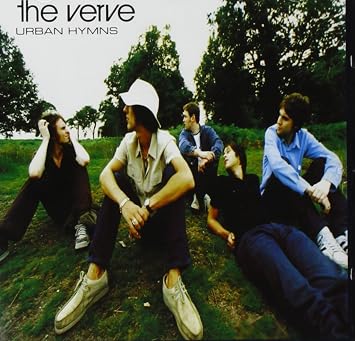
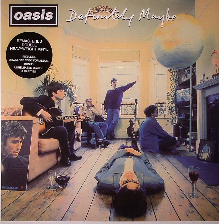
During research and investigation in
to some Britpop digipaks I discovered the genre consists of the use of all the
band members being included in shot. In Oasis' definitely Maybe album and the
Verve's urban hymns the shots of the band suggest togetherness and a laddish
culture. Blur's album says this as well with an Andy Warhol iconic British
album cover of the band. The idea of this is to promote togetherness. Another
is to portray British qualities. This was done with the fashion used in the
albums above and in others albums too.
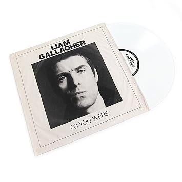
However, when researching into this I
discovered that Britpop groups such as The Stone roses, Oasis and more recently
Liam Gallagher have re-released albums of the past on Vinyl. This was done to
connect with the audience during the Brtipop genre as they used this when they
were younger This created nostalgia for the original Hollywood demographic
audience that went mad for it making them relive their younger years.
To summaries this post has helped me gain an idea of what i need to do to match the genres needs to reach the audience. From album covers of the bands togetherness to show British qualities suing fashion and location. Also, the methods of distribution helping create more sales with CD and streaming reaching the current Hollywood demographic. However, using vinyl would reach the 90's youth and help them remember how they consumed their music product creating a sense nostalgia for them. I will take this on board and into consideration of what the target audience would want when progressing into the final digipak template.
What is on a typical digipack?
What is on a typical digipack?

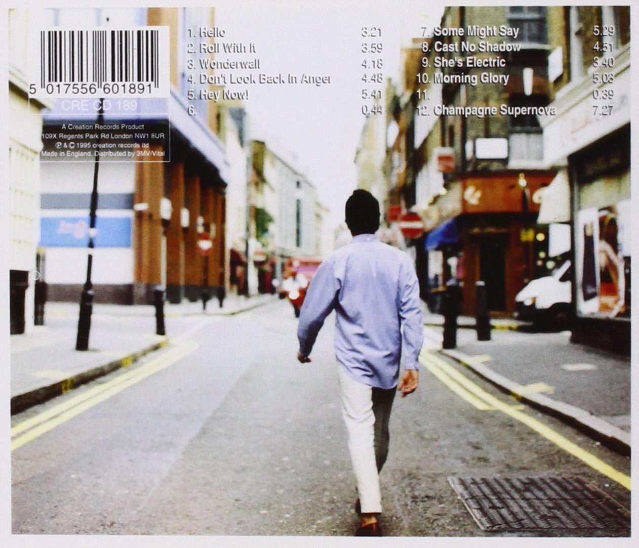

On the front cover of all albums a
main image is displayed on the front cover matching the genres conventions.
Another feature is the album name as well as the performer or performers. In
this case it would be (What's the story) Morning glory? and Oasis. Sometimes
the performers name is displayed as a logo to create a franchise image just
like Oasis have done.
On the back
cover of the CD digipak it involves song names. This is so a song can be played
specifically matched to a song number allowing the audience to have choice of
what to listen to. Another feature is institutional information such as
record label, photography etc. This done due to copyright and showing that the
album has permission to content displayed and imputed onto the album.
Another feature is a barcode in order to buy the album itself from
stores.
This is a
spine above used on the fold of CD. This again consists of the Album name
and performers name again. This is done on the CD but not on a Vinyl. As I
decided to also to sell on Vinyl due to target audience being able to
reach both mainstream current and mainstream Britpop era of the 90's I felt it
would be a good idea to distribute both on CD and Vinyl to
create nostalgia.
The purpose of this
post was to gain an idea of what I need to to include on my digipak template to
make it look realistic as if it was a real album being sold in a shop. This
information is key in order to make it perfection.
Digipak and VinylLayout
Digipak Layout:
This is the layout of the digipak i will be using for the final layout for my album. I have labelled different sections of this digipak template so in the future i can place images and institutional information into the correct places.

This template below will also help me create my vinyl cover too using just the front and back cover of the CD.

In summary this template will help me in the future places images and information in the correct place. Once i have researched information to make it look professional and match conventions this template will come in handy to make it look the best it can.
Editing Log - Session 7
Editing Log - Session 7:
We first started this by doing the easiest thing first and that was removing the live footage. This was done because of copyright issues with the filming company recording the concert. I didn't have any rights to use it for entertainment purposes therefore I wouldn't have been able to use it. One it was removed we replaced this section with new clips involving myself lip syncing the part which was originally the live footage of the crowd singing it. The clip was trimmed down to the required length to get the sector required using the cut tool.
Afterwards, we focused on lip syncing. This was done by adding in the new clips of lip syncing sections to the parts we that did not fit in time to the singing. We discovered at the start that we could use the same clips but we placed them in time as it was a few milliseconds out of time. But in the second part of the music video we established new shots of lip syncing to improve the errors made from the rough edit. This included some band shots of me singing with the band around me in a mid-long shot with a brick wall back drop to add empathises the urban qualities and convention.
Once completed we moved onto adding more band shots. This included more shots of Jack on the guitar and all the band members in shots. We decided after looking over Goodwin's theory to include more shots of the Band messing about to help implement to the audience what type of people we are. Messing about helps display conventions of a typical Britpop band. These shots were ultimately added to help display conventions more clearly to the audience making sure it suited the genre more.
Finally, we added special effects. We first started this by adding colour isolation to the intro. This effect was done as it has been used in the original Wonderwall Video itself and we decided to include it. This was done to help portray similarities. We highlighted items to exaggerate conventions i.e. my blue Adidas jacket and the guitar. We also included split screens to. This is also because it was used in Wonderwall. We did this too to help exaggerate conventions with them being displayed multiple times. Once this was complete transitions of flashes and fades were added as these were typical conventions included in most Britpop videos. This effect also helped highlight the mood of the song as well as make shot continuity flow smoother.
In this final session of editing we worked upon weaknesses we found from audience feedback and focus groups. I worked mostly on this editing session adding in the shots and syncing them in as well as the special effects part as i knew how to do it. I was in control but both Jacks had their influence helping put forward their ideas and working on what was the best option on a particular shot, transition and special effect.

Session 7 consisted on working on
feedback given towards us from the rough edit. This included lip syncing, band
shots, special effects, transitions and removal of live footage. We knew this
was going to be a long session to get through all of us so we dedicated a day
to get this complete.
We first started this by doing the easiest thing first and that was removing the live footage. This was done because of copyright issues with the filming company recording the concert. I didn't have any rights to use it for entertainment purposes therefore I wouldn't have been able to use it. One it was removed we replaced this section with new clips involving myself lip syncing the part which was originally the live footage of the crowd singing it. The clip was trimmed down to the required length to get the sector required using the cut tool.
Afterwards, we focused on lip syncing. This was done by adding in the new clips of lip syncing sections to the parts we that did not fit in time to the singing. We discovered at the start that we could use the same clips but we placed them in time as it was a few milliseconds out of time. But in the second part of the music video we established new shots of lip syncing to improve the errors made from the rough edit. This included some band shots of me singing with the band around me in a mid-long shot with a brick wall back drop to add empathises the urban qualities and convention.
Once completed we moved onto adding more band shots. This included more shots of Jack on the guitar and all the band members in shots. We decided after looking over Goodwin's theory to include more shots of the Band messing about to help implement to the audience what type of people we are. Messing about helps display conventions of a typical Britpop band. These shots were ultimately added to help display conventions more clearly to the audience making sure it suited the genre more.
Finally, we added special effects. We first started this by adding colour isolation to the intro. This effect was done as it has been used in the original Wonderwall Video itself and we decided to include it. This was done to help portray similarities. We highlighted items to exaggerate conventions i.e. my blue Adidas jacket and the guitar. We also included split screens to. This is also because it was used in Wonderwall. We did this too to help exaggerate conventions with them being displayed multiple times. Once this was complete transitions of flashes and fades were added as these were typical conventions included in most Britpop videos. This effect also helped highlight the mood of the song as well as make shot continuity flow smoother.
In this final session of editing we worked upon weaknesses we found from audience feedback and focus groups. I worked mostly on this editing session adding in the shots and syncing them in as well as the special effects part as i knew how to do it. I was in control but both Jacks had their influence helping put forward their ideas and working on what was the best option on a particular shot, transition and special effect.

Subscribe to:
Comments (Atom)