Font Research:
The fonts used in typical albums by Britpop bands tend to be very bland and simple. This also helps connate that the band are simple just ordinary people too. Many of the bands use clear block white/black texts to display the Album name, song titles and institutional information on the Digipak.
The text I have decided to use on both my Magazine Article and Digipak is Superclarendon. In a white colour. This to stand out of the black dull background and to be eye-catching to the audience. I think this font suits the genre conventions based of off my research as it is very simple and can be used to display the information I want.
The reason for this research is to gain an idea of what font I can use in order to make sure it matches the conventions of the genres and look realistic to an album typical of the Britpop genre.
My Initial Idea
My Initial Idea:
I will Create synergy by using the colour isolation technique on Photoshop. This is because across 3 different media platforms it will be done helping create synergy. The album will also be could Wonderwall as most albums are titled after a song title. This synergy of Wonderwall on all media platforms as well as the colour isolation help create relativity to the audience showing a relationship between the products. This is because colour isolation is iconic not just in my version of the Wonderwall video but the original, spreading this across all platforms helps connote its significance.
My other pictures on my digipak will include black and white images of urban features linking to the convention of urban areas and Britpop relation.
For my advert in the magazine I will include all the institutional information as well as colour isolation too for synergy purposes. This will also be set in an urban area too for convention purposes. I will include a review section to relate to mainstream audience as they would be influenced by big magazines opinions on the album.
The purpose of this post was to summarise relationship and synergy and the reasons for it across the media platforms.
My idea for both of the
ancillary tasks is to display the band members all together. This is
because it is a key pattern I found whilst researching the genre
conventions. So in my shots I will have the band members together. This
will be done on the magazine as the image itself and the front cover of the CD.
I will Create synergy by using the colour isolation technique on Photoshop. This is because across 3 different media platforms it will be done helping create synergy. The album will also be could Wonderwall as most albums are titled after a song title. This synergy of Wonderwall on all media platforms as well as the colour isolation help create relativity to the audience showing a relationship between the products. This is because colour isolation is iconic not just in my version of the Wonderwall video but the original, spreading this across all platforms helps connote its significance.
My other pictures on my digipak will include black and white images of urban features linking to the convention of urban areas and Britpop relation.
For my advert in the magazine I will include all the institutional information as well as colour isolation too for synergy purposes. This will also be set in an urban area too for convention purposes. I will include a review section to relate to mainstream audience as they would be influenced by big magazines opinions on the album.
The purpose of this post was to summarise relationship and synergy and the reasons for it across the media platforms.
Conventions of a Britpop Magazine Advert
Conventions of a Britpop Magazine Advert:
This research I conducted is to help me recreate the Britpop genre and to have an influence on my advert. By including the institutional information and band togetherness synergy from across all media platforms, it should have a place within the genre.

Again there is a togetherness with
the band with all of them being on display on the image. All information I
researched is on their normally. This infers to me there is a lot of synergy
between the music video and ancillary tasks as band shots are key in all
areas. Logos are a key thing which has occurred on both
ancillary tasks, digipak and magazine advert. I will go on to create my
own logo making it iconic and matching g conventions again. This
again implies synergy. It also has all institutional information
which I found which was; Album name, Artist name, release date, image and
occasionally reviews.
This research I conducted is to help me recreate the Britpop genre and to have an influence on my advert. By including the institutional information and band togetherness synergy from across all media platforms, it should have a place within the genre.
What is on a typical magazine advert?
I will take this research on board to create an idea of what to include in the advert. It isn't common reviews are on magazine adverts but I will be using it due to it having an effect on the target audience listening to mainstream thoughts which would help push sales up. Basically, I will include all the information I have discovered, as it is on most adverts I have researched.
On a typical album
advertisement within magazines consist of an image of the artist,
artist's name, album names advertised, release date as well as the occasional
reviews from well-known music critics in the magazine industry. This
information is then digested by the audience reading it and having an effect on
them to know whose album it is and when it is coming out.
I will take this research on board to create an idea of what to include in the advert. It isn't common reviews are on magazine adverts but I will be using it due to it having an effect on the target audience listening to mainstream thoughts which would help push sales up. Basically, I will include all the information I have discovered, as it is on most adverts I have researched.
Conventions of a Britpop Digipak
Conventions of a Britpop Digipak:


To summaries this post has helped me gain an idea of what i need to do to match the genres needs to reach the audience. From album covers of the bands togetherness to show British qualities suing fashion and location. Also, the methods of distribution helping create more sales with CD and streaming reaching the current Hollywood demographic. However, using vinyl would reach the 90's youth and help them remember how they consumed their music product creating a sense nostalgia for them. I will take this on board and into consideration of what the target audience would want when progressing into the final digipak template.
A digipak is the layer around the
actual CD case that supplies information of the band, record company and song
names. The Britpop genre uses these but in particular styles.
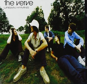
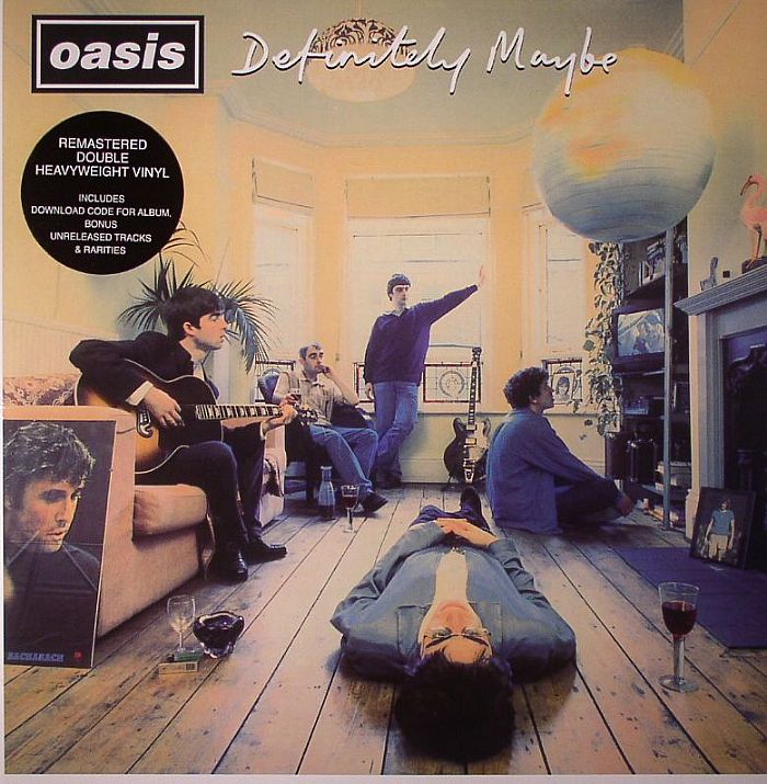

During research and investigation in
to some Britpop digipaks I discovered the genre consists of the use of all the
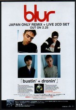
band members being included in shot. In Oasis' definitely Maybe album and the
Verve's urban hymns the shots of the band suggest togetherness and a laddish
culture. Blur's album says this as well with an Andy Warhol iconic British
album cover of the band. The idea of this is to promote togetherness. Another
is to portray British qualities. This was done with the fashion used in the
albums above and in others albums too.


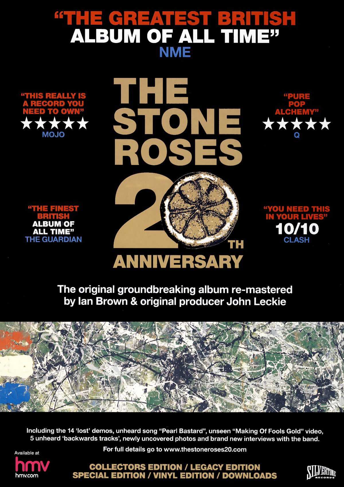
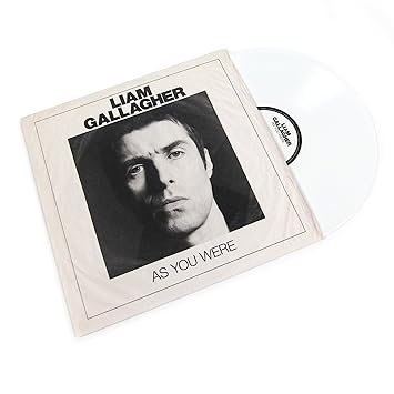
However, when researching into this I
discovered that Britpop groups such as The Stone roses, Oasis and more recently
Liam Gallagher have re-released albums of the past on Vinyl. This was done to
connect with the audience during the Brtipop genre as they used this when they
were younger This created nostalgia for the original Hollywood demographic
audience that went mad for it making them relive their younger years.
To summaries this post has helped me gain an idea of what i need to do to match the genres needs to reach the audience. From album covers of the bands togetherness to show British qualities suing fashion and location. Also, the methods of distribution helping create more sales with CD and streaming reaching the current Hollywood demographic. However, using vinyl would reach the 90's youth and help them remember how they consumed their music product creating a sense nostalgia for them. I will take this on board and into consideration of what the target audience would want when progressing into the final digipak template.
What is on a typical digipack?

On the front cover of all albums a
main image is displayed on the front cover matching the genres conventions.
Another feature is the album name as well as the performer or performers. In
this case it would be (What's the story) Morning glory? and Oasis. Sometimes
the performers name is displayed as a logo to create a franchise image just
like Oasis have done.
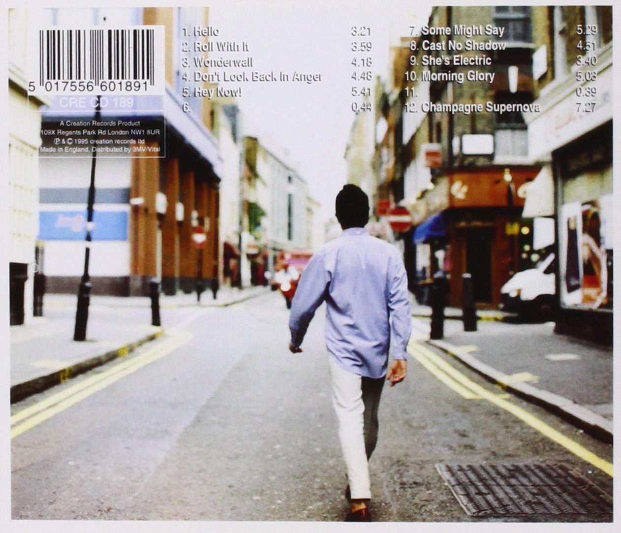
On the back
cover of the CD digipak it involves song names. This is so a song can be played
specifically matched to a song number allowing the audience to have choice of
what to listen to. Another feature is institutional information such as
record label, photography etc. This done due to copyright and showing that the
album has permission to content displayed and imputed onto the album.
Another feature is a barcode in order to buy the album itself from
stores.
This is a
spine above used on the fold of CD. This again consists of the Album name
and performers name again. This is done on the CD but not on a Vinyl. As I
decided to also to sell on Vinyl due to target audience being able to
reach both mainstream current and mainstream Britpop era of the 90's I felt it
would be a good idea to distribute both on CD and Vinyl to
create nostalgia.
The purpose of this
post was to gain an idea of what I need to to include on my digipak template to
make it look realistic as if it was a real album being sold in a shop. This
information is key in order to make it perfection.
Digipak and VinylLayout
Digipak Layout:
This is the layout of the digipak i will be using for the final layout for my album. I have labelled different sections of this digipak template so in the future i can place images and institutional information into the correct places.
This template below will also help me create my vinyl cover too using just the front and back cover of the CD.
In summary this template will help me in the future places images and information in the correct place. Once i have researched information to make it look professional and match conventions this template will come in handy to make it look the best it can.
Subscribe to:
Posts (Atom)